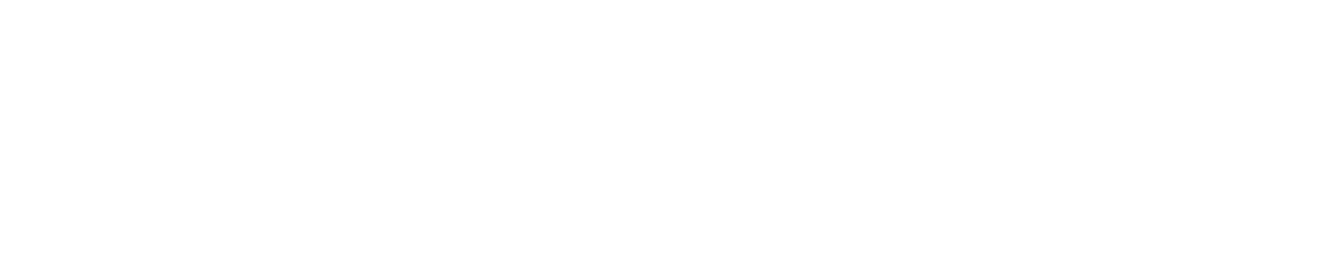
BobaZone
A thoughtful vehicle system to manage personal sound zones in an Automobile
Team: Wendy, Tyler, Ankur, Sharon
Duration: 3 months
The Challenge
A car with multiple passengers has become a place filled with “tech audio clutter”: personal tablets playing movies in one seat, Bluetooth phone calls in another, and navigation prompts interrupting in-car music. HARMAN created an integrated audio entertainment technology that provides every passenger the freedom to choose his or her own audio entertainment while maintaining a harmonious in-cabin experience.
We collaborated with HARMAN Team to design a thoughtful user interface to manage different audio experiences and test & quantify the overall subjective user experience of such a technology.
Design Process
My Role
Shaping Design Problem
I was responsible for investigating our target users and defining user characteristics in terms of demographics, cognitive aspects, personality features, and motivations. I converted evidence from literature review to design implications in the initial hypotheses stage; interpreted data of affinity mapping.
Design leadContributed 12+ ideas in brainstorm sessions. Used alternative design thinking to innovate the in-car experience which served as a critical turning point in our design direction.
Development of interactive prototype
I created visual design language for the system; Designed all digital interfaces for the driver’s dashboard; Implemented the instrument cluster prototype. I tutored one novice designer in our team to create HMI for the passenger’s side.
Empathetic Research Methods
I gathered insights by facilitating interviews, cognitive walkthroughs & usability tests for drivers. I interpreted quantitative metrics and compiled all the findings.
Defining a Problem
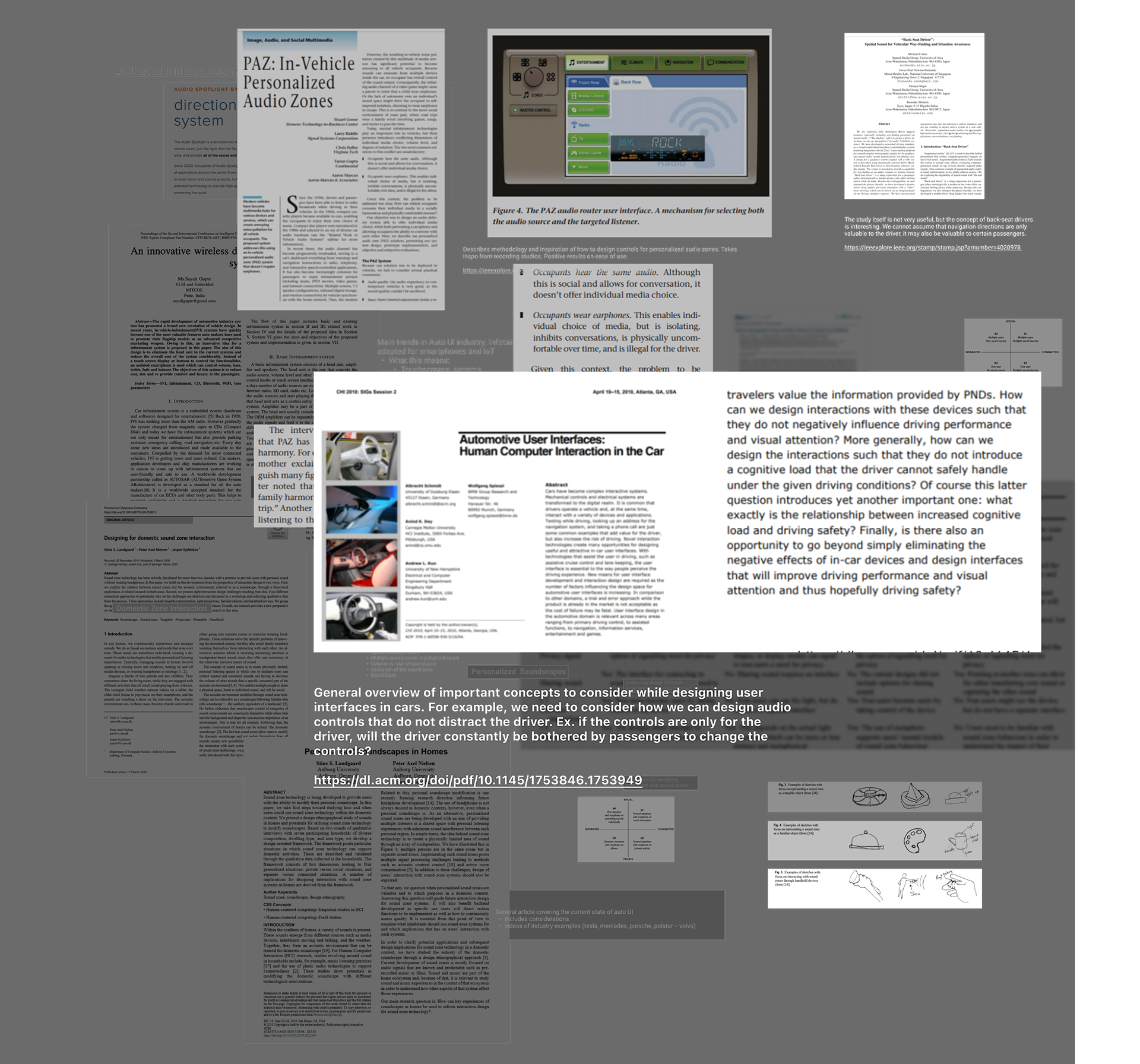
Literature Review
The information used to analyze and better understand our problem space was gathered through client interactions, websites, online articles, scholarly journal articles, and existing/related systems. Due to the lack of development of sound zone technology in an automotive setting, we had to expand our search to related topics and keywords such as auto UI, human-car interfaces, sound zones, and domestic soundscapes.
Who Are The Users? What are the characteristics?
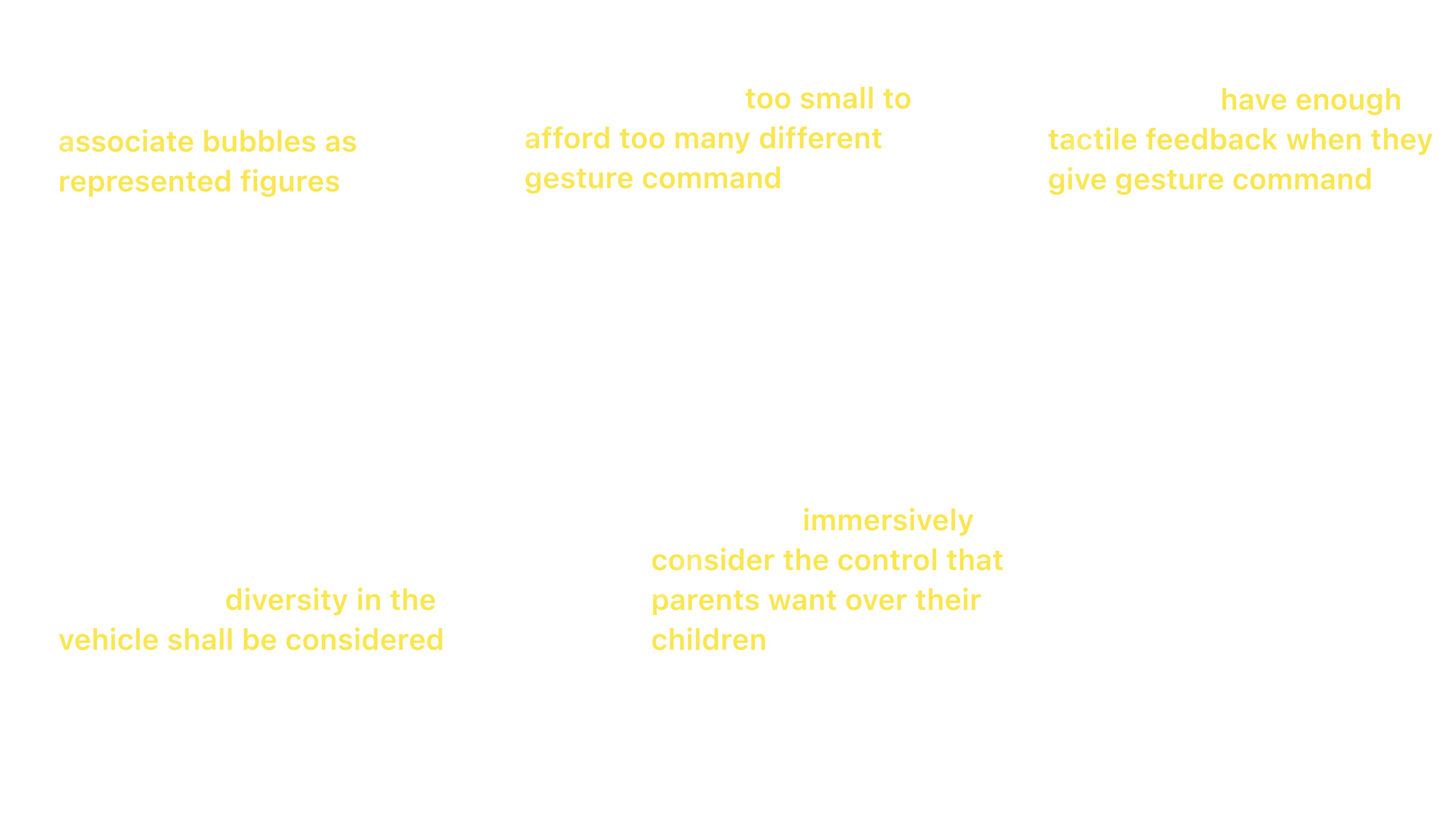
Our intended user group is family travelers, which include many types of traveling parties defined by the US Travel Association, such as married couples traveling together, or with their children siblings with relatives, LGBTQ parents with their children, and so on.
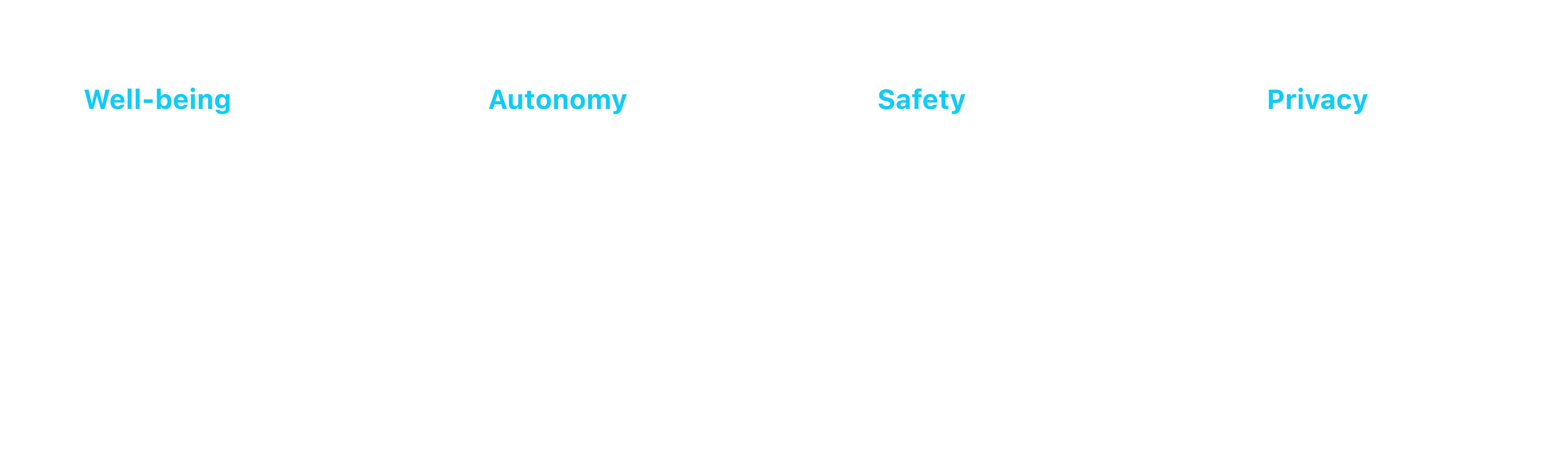
What Do Users Value?
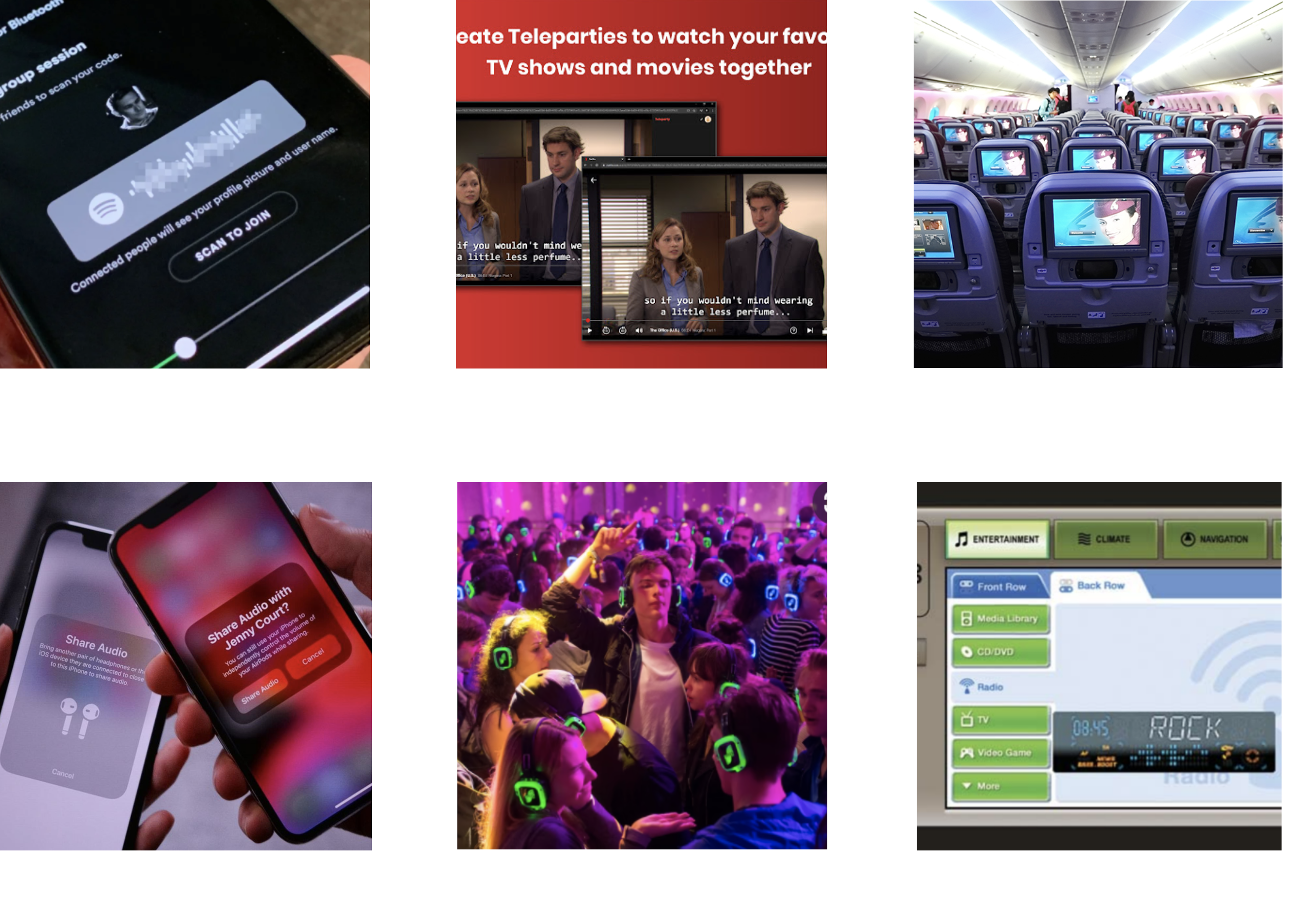
Design Space Critique
Since there are no existing forms of this car audio technology currently on the market, we compared and analyzed other types of personal and shared audio experiences that currently exist. These include:
User Research
Semi-structured interview
The flexible nature of semi-structured interviews allowed us to capture interesting points and have more in-depth discussions according to participants' responses. At the same time, we believed that family travel is a topic grounded in memories and stories. Unlike surveys, the open-ended questions of semi-structured interviews created a dialogue that allowed us to explore more possibilities in our problem area.
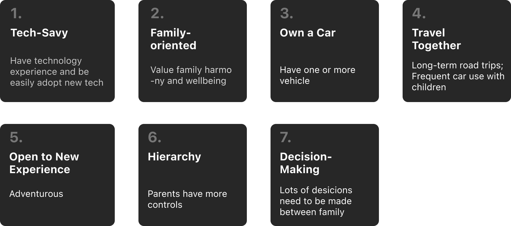
3 User groups
- Parents + 16 yrs old girl + 2.5 yrs old boy
- Mon + 8 yrs old twin boys
- Mon + 5 yrs old girl + 11 yrs old girl
Affinity Mapping
Within 48 hours of each interview, we conducted interpretation sessions to create the affinity notes that we used to construct our affinity wall.
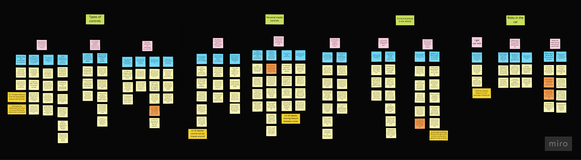
Take-Aways
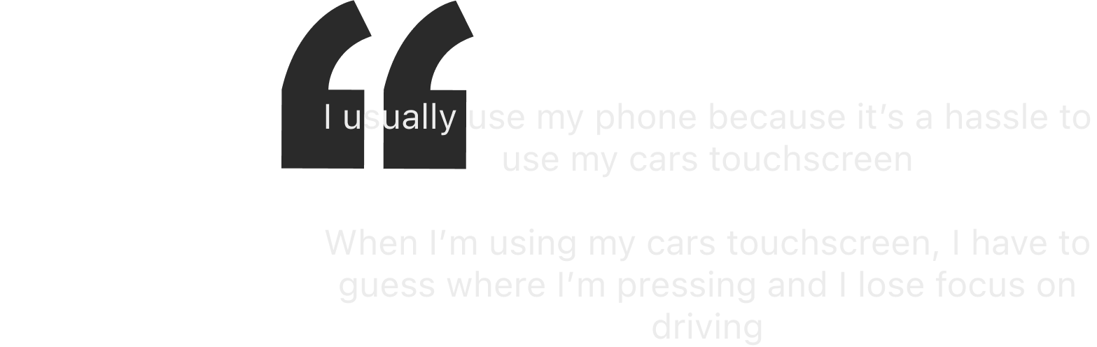
1. Current car media controls are frustrating and inaccurate
Findings revealed that parents preferred to use their phone over their car’s infotainment system, experienced delayed responsiveness with their car’s media controls, had difficulty using controls as the driver, and struggled to connect their device using Bluetooth.
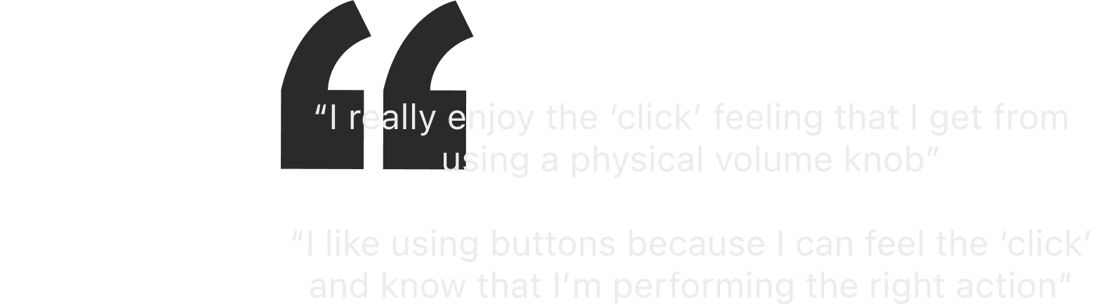
2. Users enjoy the tactile feedback that physical buttons provide
Our interviewees not only described the tactile “clicking” sensation of using physical buttons as satisfying to use but also functional in the sense that it provided them with feedback that confirmed the actions that they intended to perform.
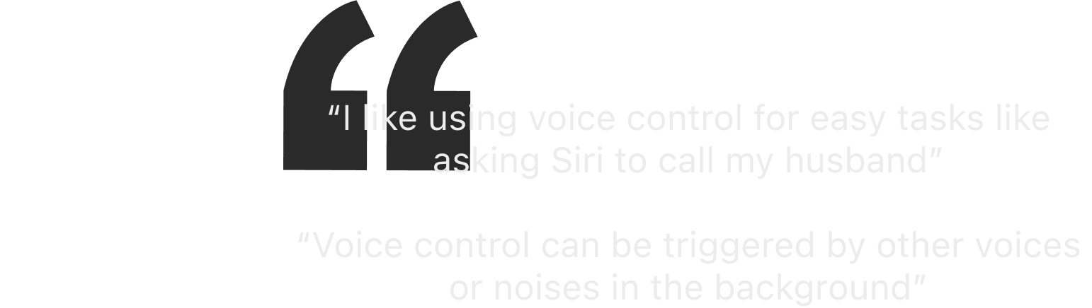
3. Users enjoy voice control, but find that it can be problematic to use
Our findings indicate that voice control is a convenient and helpful form of media control, but not the most reliable. There are personal and environmental factors that limit how effective voice control can be and discourage users from embracing it. For example, users struggle using voice control because it either does not understand them or it hears the commands incorrectly.
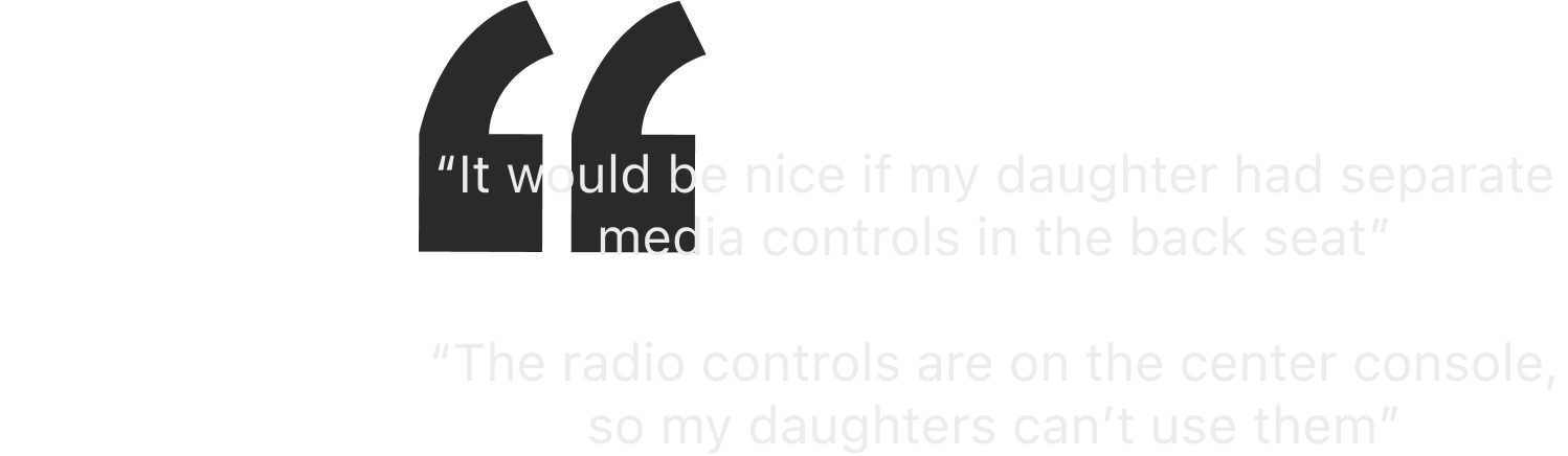
4. Other passengers control media if it is necessary and available
Our affinity findings indicated that passengers who are not driving will control media in the car, but these controls are currently limited and could be more accessible.
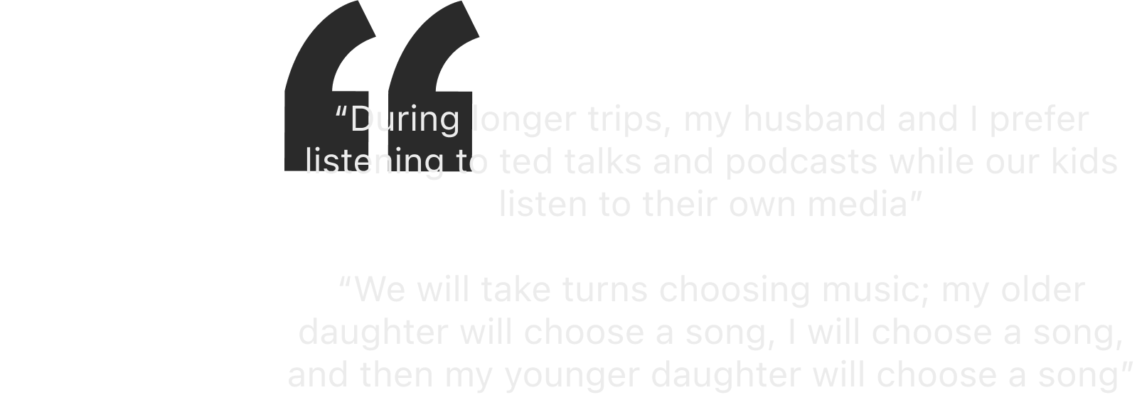
5. Personal space and media preferences are important things to account for when the family is in the car
Families and passengers find different ways of enjoying the media that they prefer listening to. They may do it cooperatively and take turns accounting for each other's preferences.
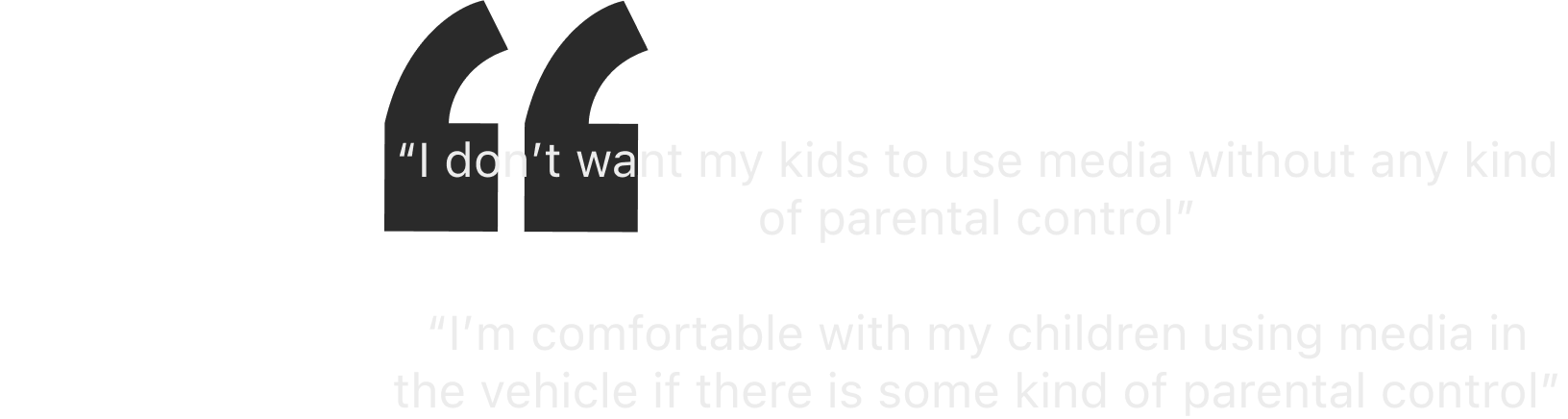
6. Parents want to have some control over their children's media consumption
The two interviewees with younger children both expressed a desire to manage their children's media consumption at different times.
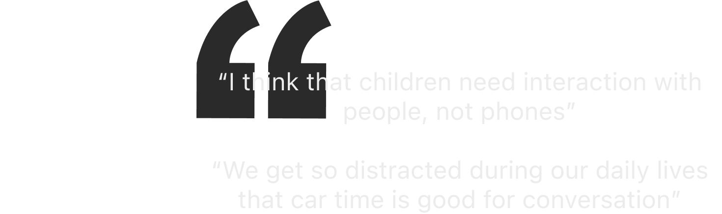
7. The car is viewed as a place for social bonding and communication
It revealed that parents viewed the time in the car as a time to chat and catch up with their family. However, This finding goes against the general nature of sound zone technology. It shows that personalized media usage is not always going to be desired by families.
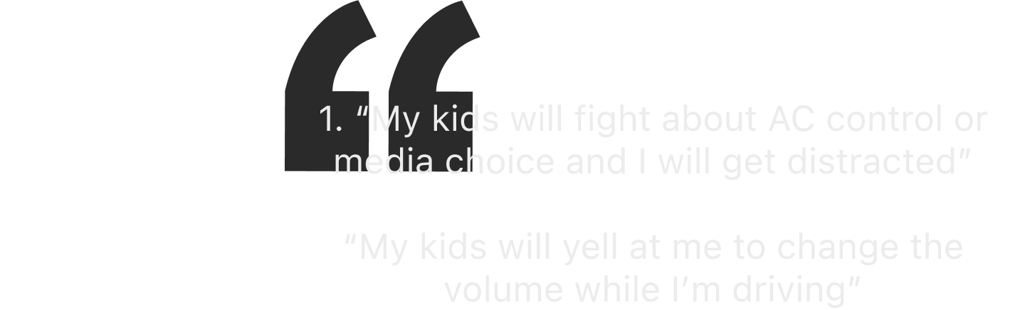
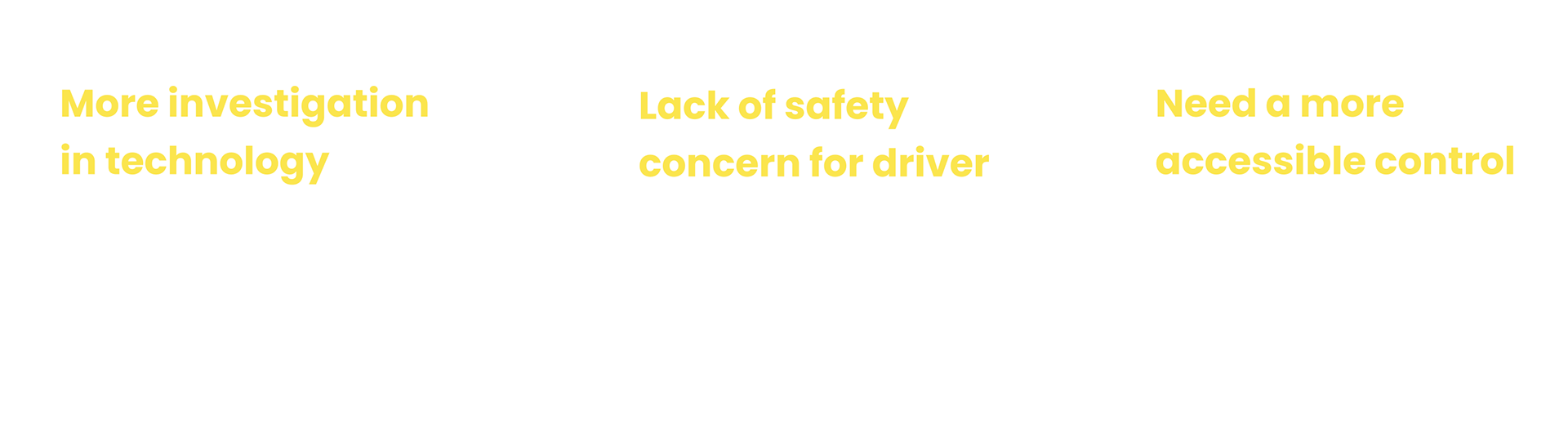
8. Current methods of media use and control make driving less safe for the driver and other passengers
This finding shows how current forms of media control and usage in the car can lead to unnecessary distractions and other potential safety hazards.
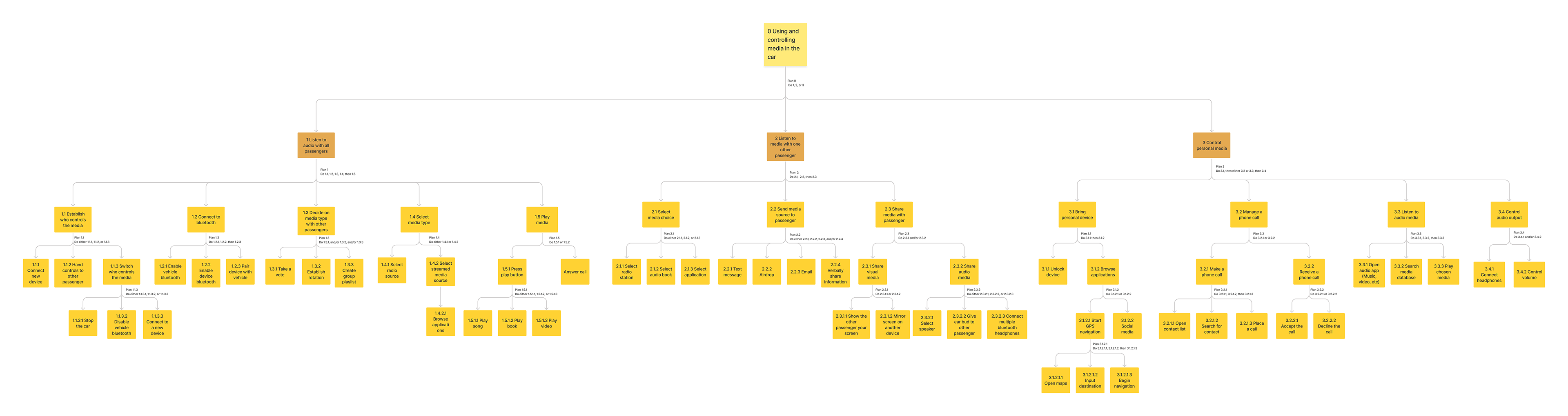
Hierarchal Task analysis
Then we did the task analysis to better understand how users control and use the media in the car currently. Based on our initial research in the problem area, our task environment will be defined as a four-seated automobile with users occupying all four seats. In consideration of our target users -- families -- our task environment will reflect a frequent scenario in which the parents are sitting in the front and children are sitting in the back.
Translating findings & analysis results to design requirements
Functional Requirments

Non-Functional Requirments

Brainstorm
Crazy 8's design sprint + Contextual brainstorm
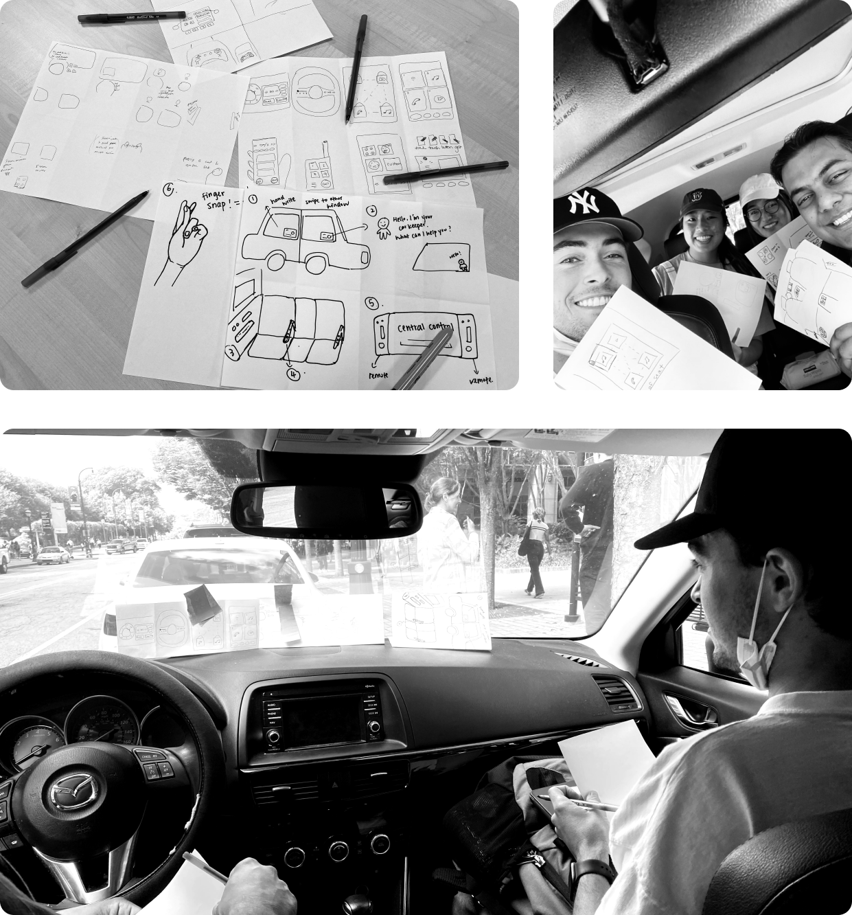
Keeping the design requirements in mind, We did two rounds of brainstorm sessions, one was Crazy 8’s design sprint, Each member of the team had 8 mins to develop 8 design ideas and voted on the top two ideas. We then went to the next level by doing another round of Crazy 8’s while sitting in a car. Our task this time was to come up with 4 new design ideas in 8 minutes.
Narrowing down to 2 top ideas
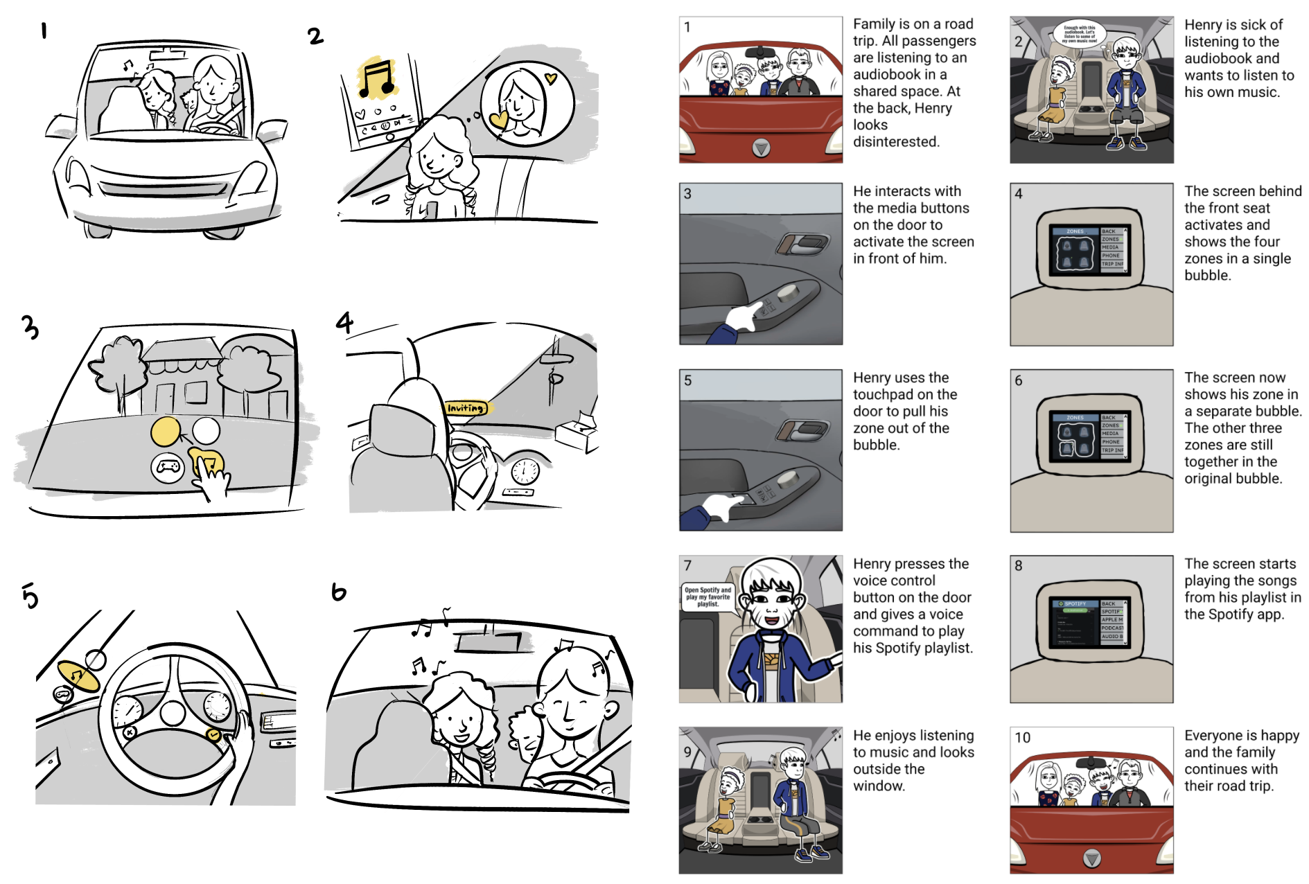
Clients feedback + Storyboards + Evaluation
I and another teammate drew the storyboard of the concept and pitched the idea to our client. They provided us with feedback on both concepts for us to consider moving forward.
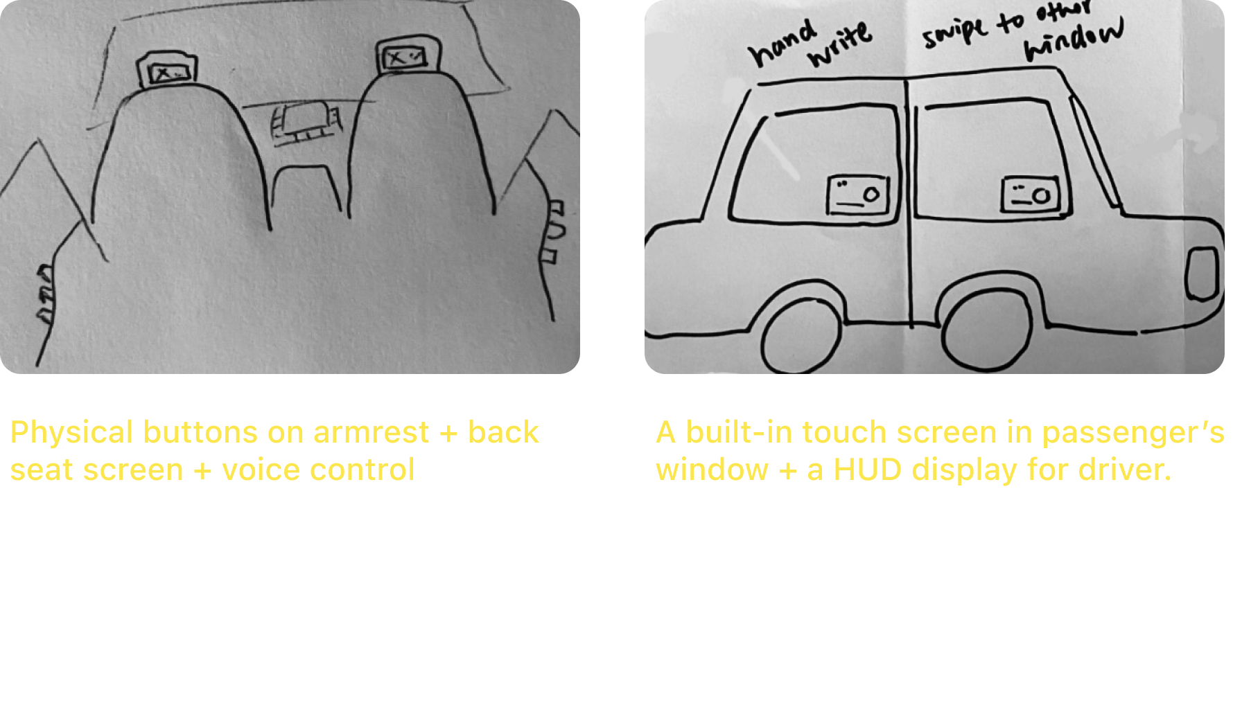
Wao Window vs Arm's Reach
Afterward, we evaluated each concept against our design requirements and listed the pros and cons of each idea.

Refined design + Low-fidelity prototype
Final design direction: BobaZone
Both of these design concepts satisfied all of our functional and non-functional requirements, so our decision was primarily based on the above considerations, With these in mind, we decided to combine the elements from our 2 final design concepts to create our final product: Bobazone.
Conform to the user's psychological model, more ergonomic & clean & intuitive design, utilize the user's sensory experience.
For Passengers:
For Driver:
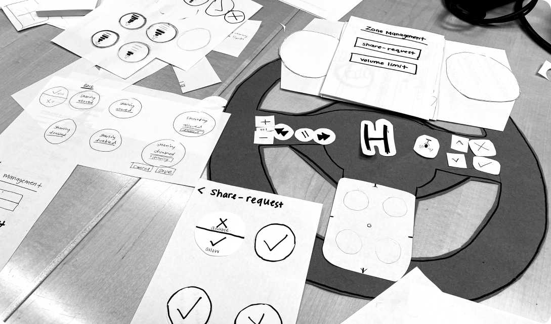
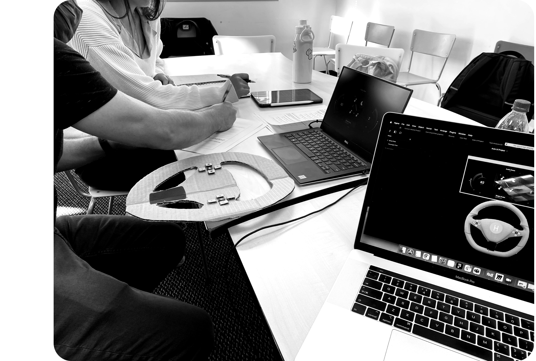
Paper Prototype + User Test Iterations
We sketched out the interfaces and made a paper prototype of the steering wheel to help us realize concepts and test designs. We conducted multiple tests within the team, with our clients and professors to keep refining the user experience by uncovering potential problems during the test.
Insights from the tests
Define
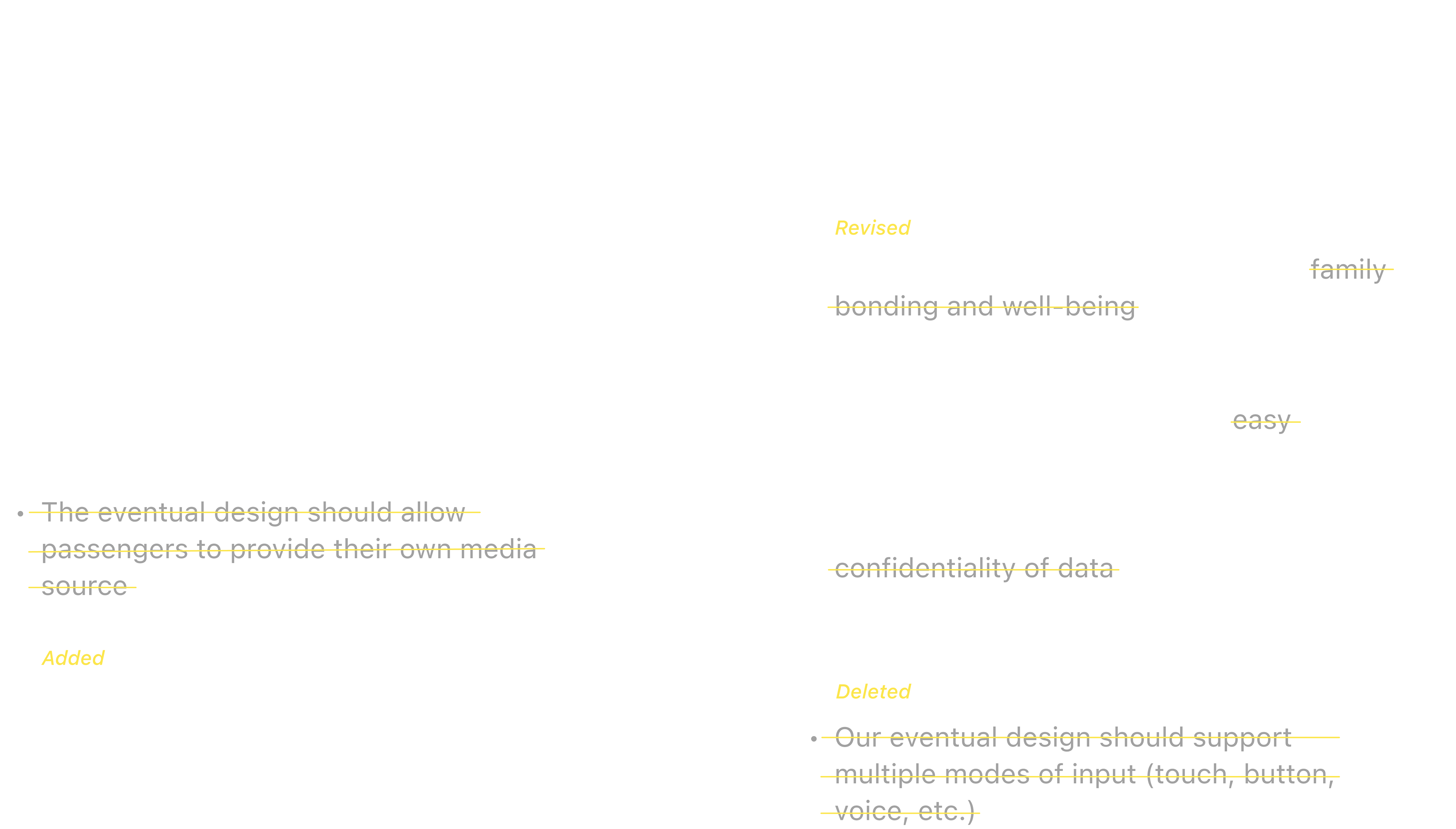
Iterated Design Requirments
Overall, taking into account our client meetings and poster feedback sessions with our peers, we made minor changes to our design requirements.
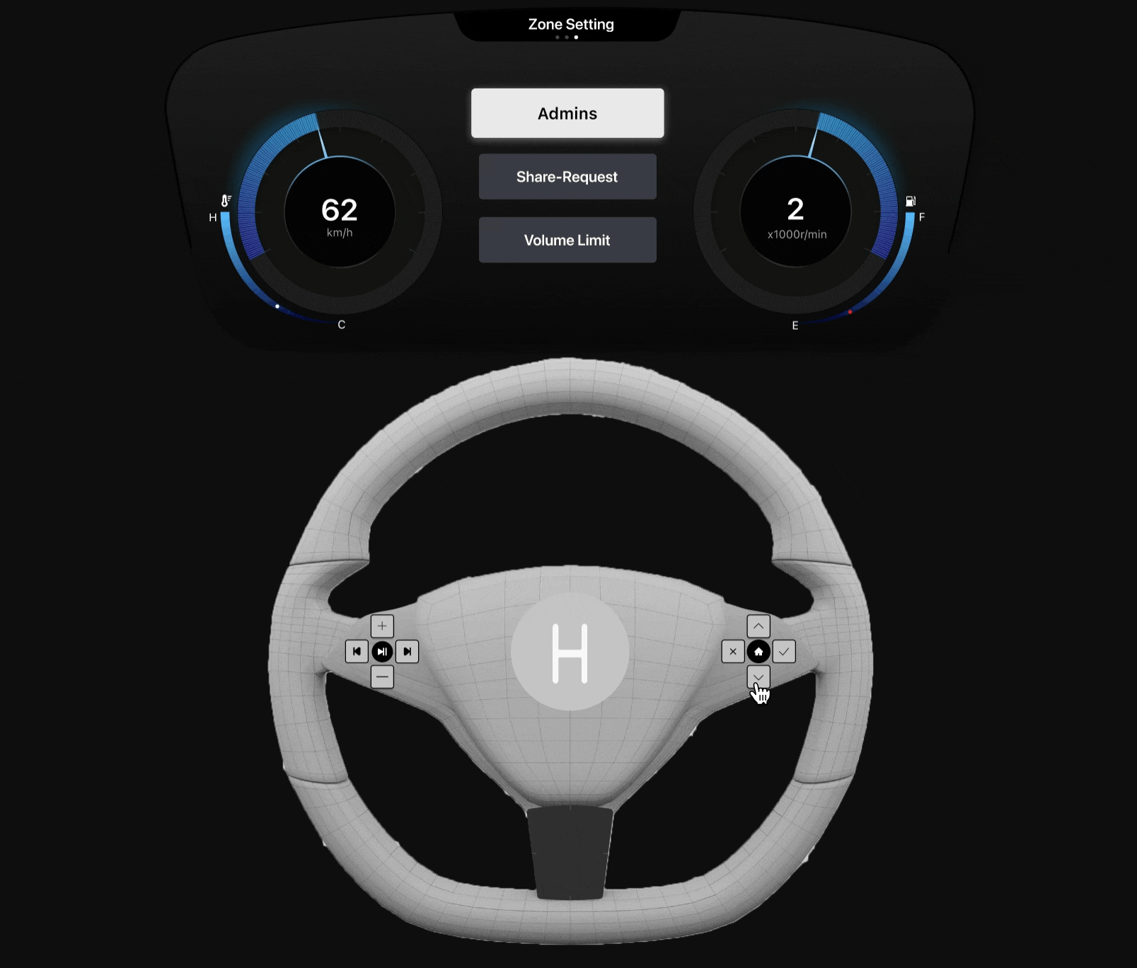
Scope of Admin control
Assign admin control (driver only):
Considering the task environment is where parents sit front and children sit at back. We decided to let the driver has permanent admin control. As our interviewees showed that they often let other passengers control the media for them for safety reasons, we designed the system which allows the driver to assign admin control to other passengers to share the power of master control.
The passenger with the admin control is accessible to the following features, but they cannot override the primary administrator who is the driver.
1. 10-sec Audio Monitoring:
According to our user interview, parents expressed that they want to know if their kids are listening or looking at appropriate media. Thus, we designed the system which allows users to monitor the audio of other passengers for a 10-second interval.
2. Set Volume Limit:
Through our client interviews, we found that having an administrator set the maximum volume limit for other passengers was a very useful function, especially for parents who want to protect the hearing ability of their children.
3. Enable/disable Media Share-request:
Admin access allows users to disable one’s media share/request function. We took into account that kids might keep playing with this function and sending notifications that may annoy others or distract the driver’s attention.
4. Override “Do not Disturb”:
Admin can also override other passengers’ “do not disturb” function to prevent the kids from isolating themselves all the time.
5. Connect/disconnect any audio zones:
Admin can also connect or disconnect bubbles that are not their own to take care of the situation that children don’t want to share the media with each other.

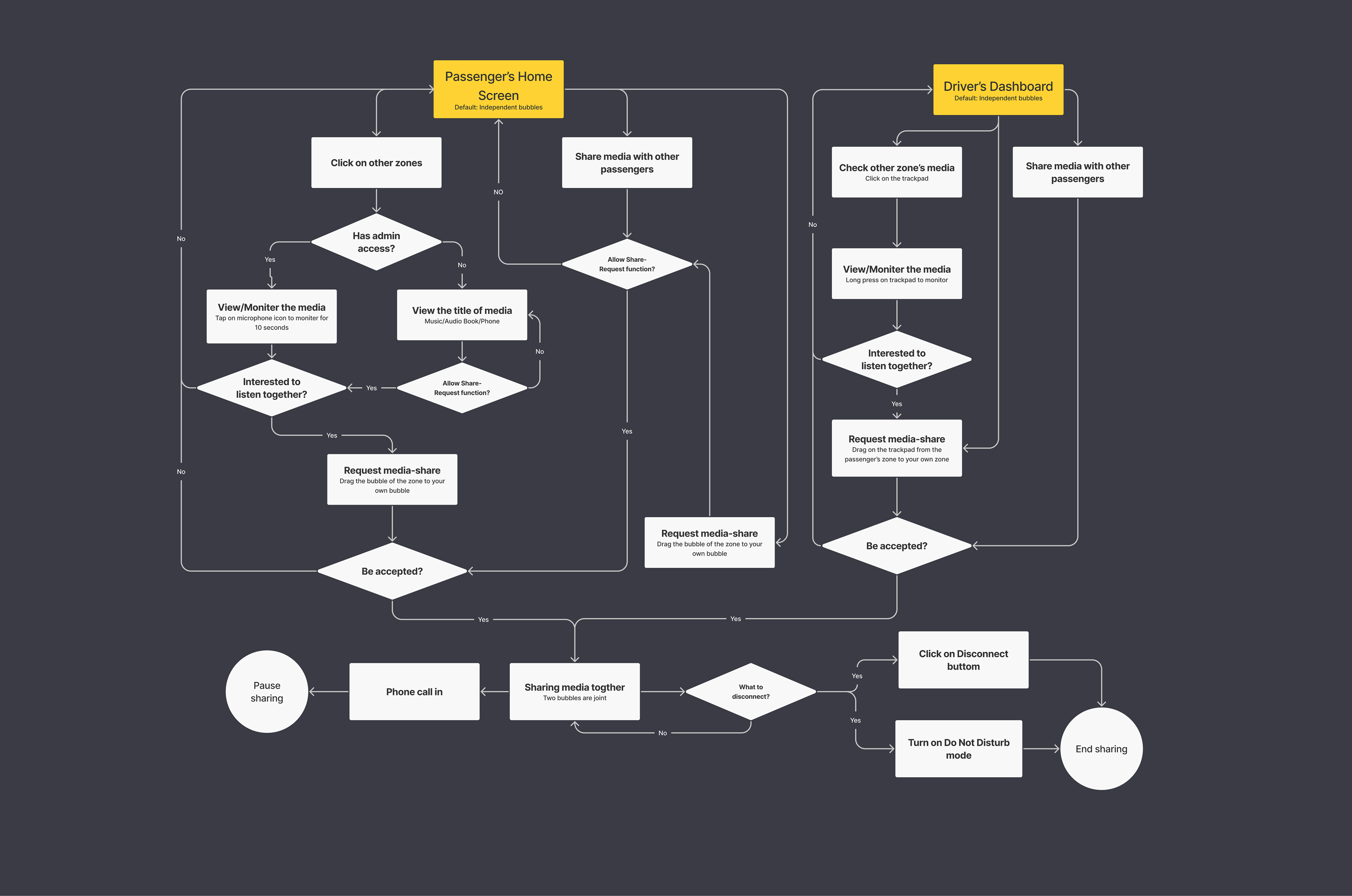
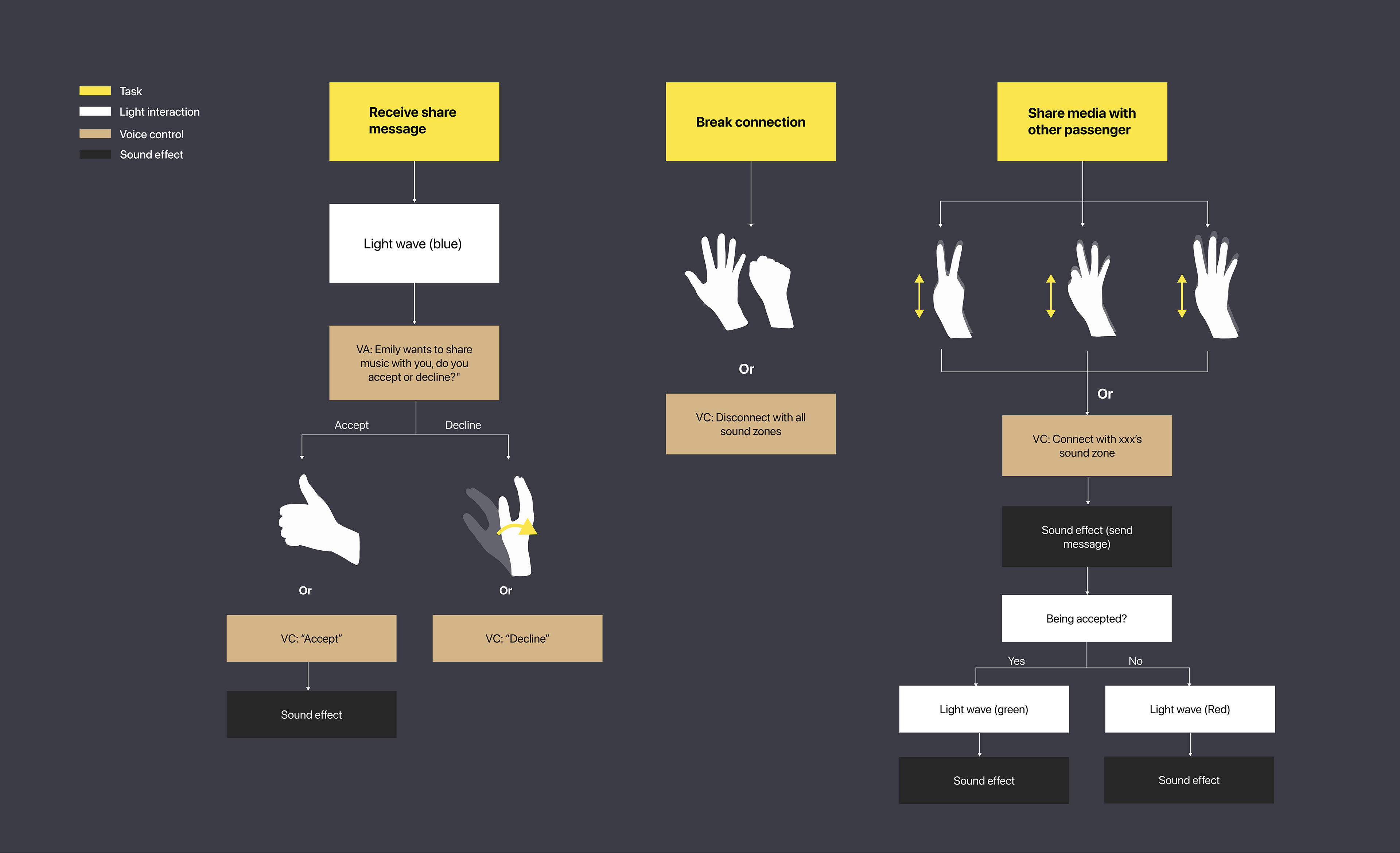
User-flow of Share-request function
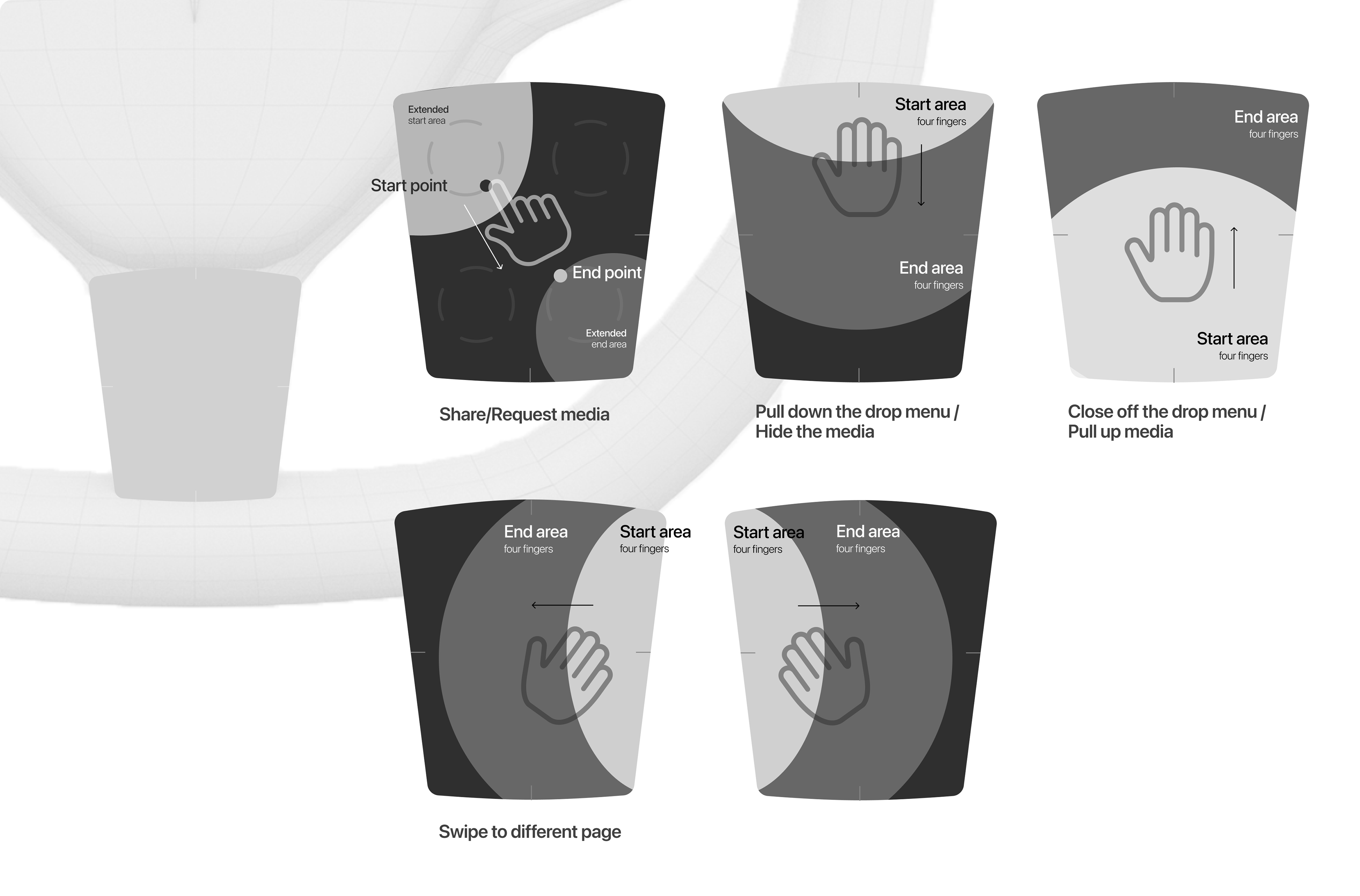
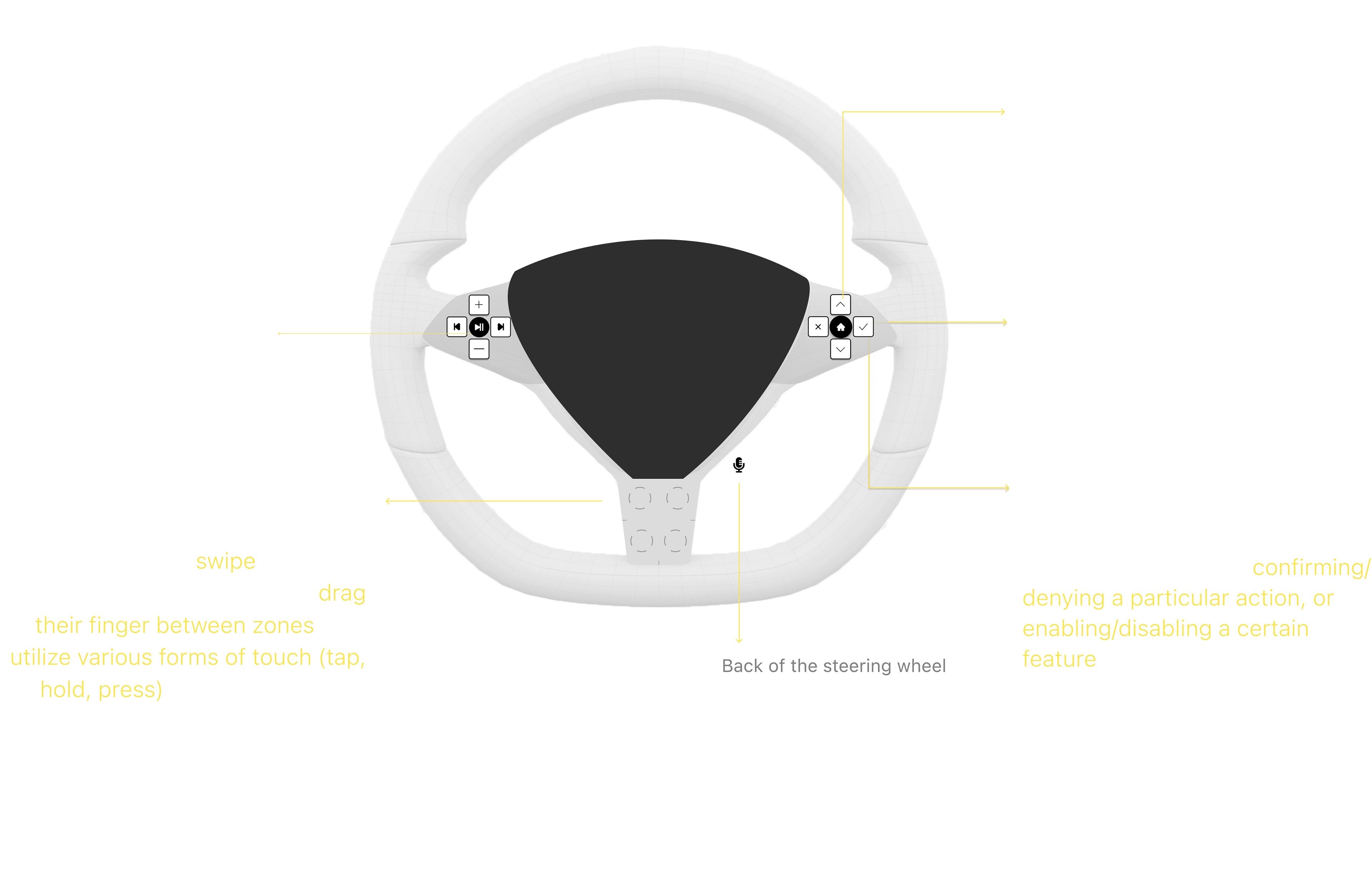
Gesture interaction
The trackpad at the bottom of the wheel contains four quadrants. To provide users with tactile feedback, each quadrant contains a ridgy circular pattern to represent the sound zone located in the vehicle. To accommodate the limited space of the trackpad, we minimized the gesture interaction as swipe left, right, down and drag their finger between zones, and utilize various forms of touch (tap, hold, press) in order to activate certain features in the system.
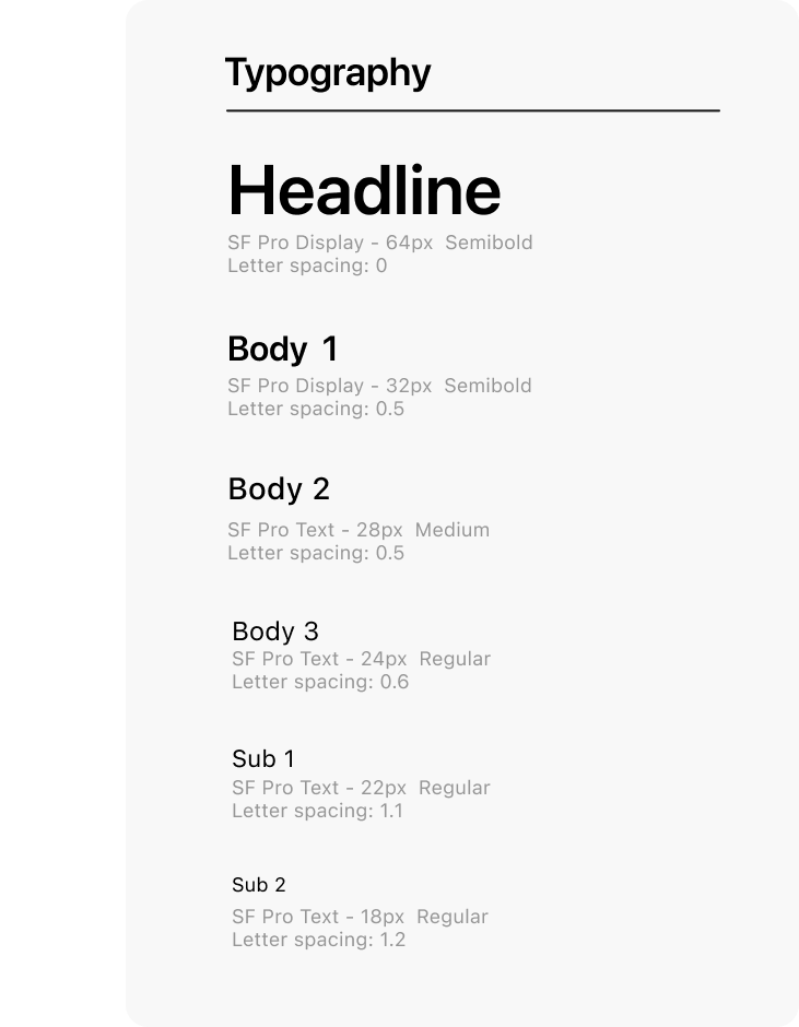
Typography
Cleanness & legibility
We chose Sans-serifs because they are easy to read with all different sizes. They have clean lines and sharp edges other than serif fonts which have loops and swirls. Thus, the cleanness of sans-serif increases legibility for users.
In terms of font size, we referred to Google design for driving which is already systematically designed for drivers to be able to see. Because the display screens for passengers are similar in size to mobile phones, we referred to the universal font size which is 18px is the minimum size for body text in mobile apps. However, as we consider that the placement of screens is about one arm away from the user’s eyesight which is further than the user read on their phone, thus we used 18px for subtext and a bigger font size for body text and headlines as well.
Color Scheme
Simple, Calming & Futuristic
The primary color we used is black, white, and grey and have the bright color (white and light grey) overlaid on a black background to create high contrast for the driver to perceive information quickly and easily.
We also add blue as the only hue color because we want to keep the visual color simple so as not to distract the driver's vision. We chose the blue and gradient colors (a mix of blue and purple) to create a sense of futuristic since our technology is new to the world. Also, cool colors create a sense of peace which is good for drivers.
Icon set
Hierarchy & orbicular
We use three sets of icons to differentiate three levels of importance of information.
We chose filled icons over outlined icons because filled icons give a stronger visual impact and are more integrated. Also, we made the edges of each icon round because it matches the overall visual impression. Also, round creates a sense of harmony which aligns with our design principle.

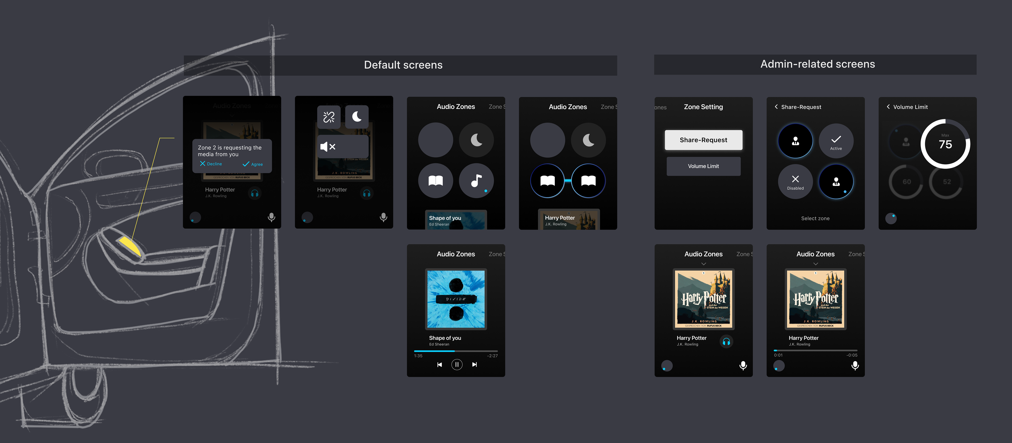
High-fidelity Prototype
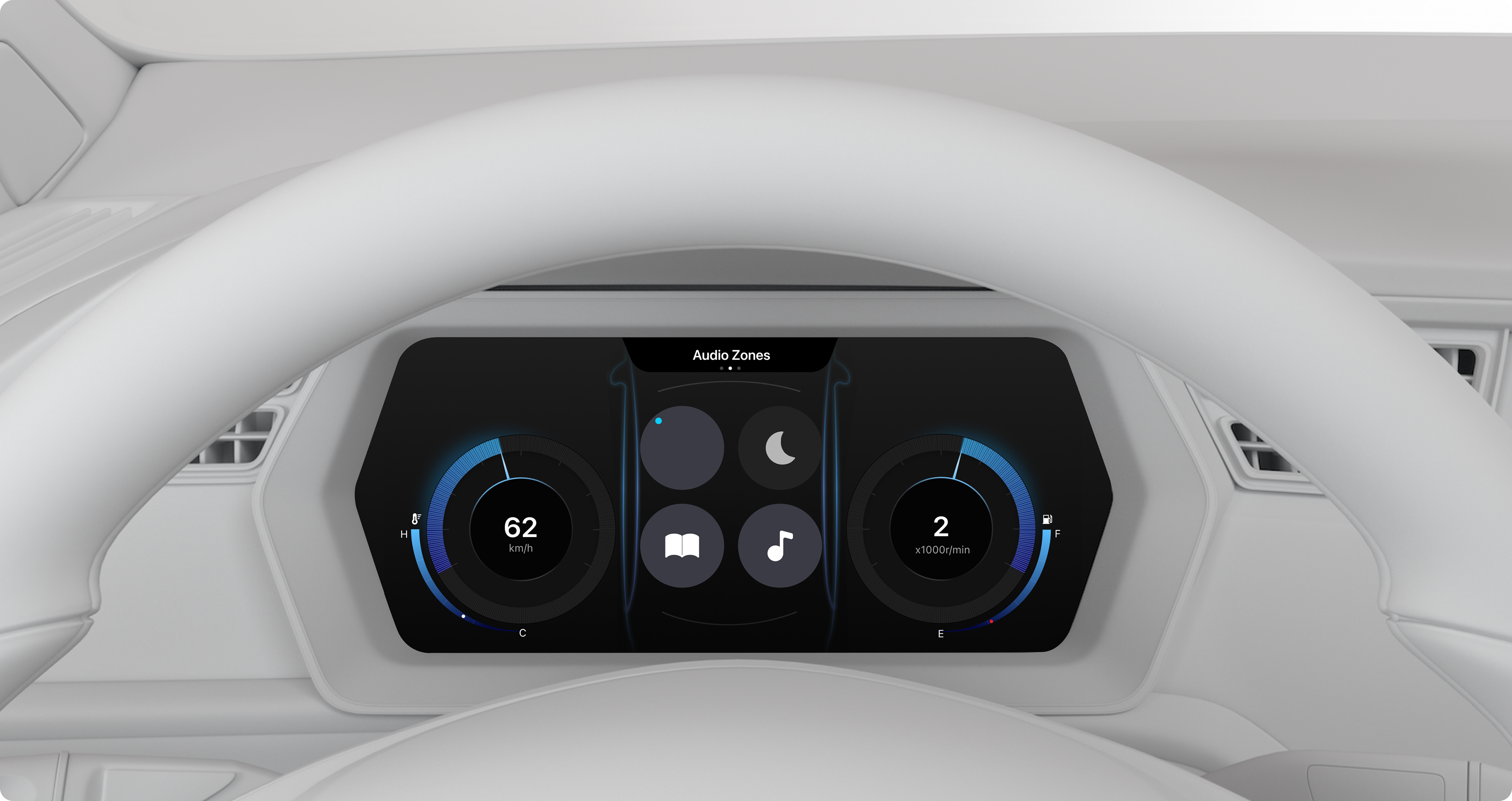
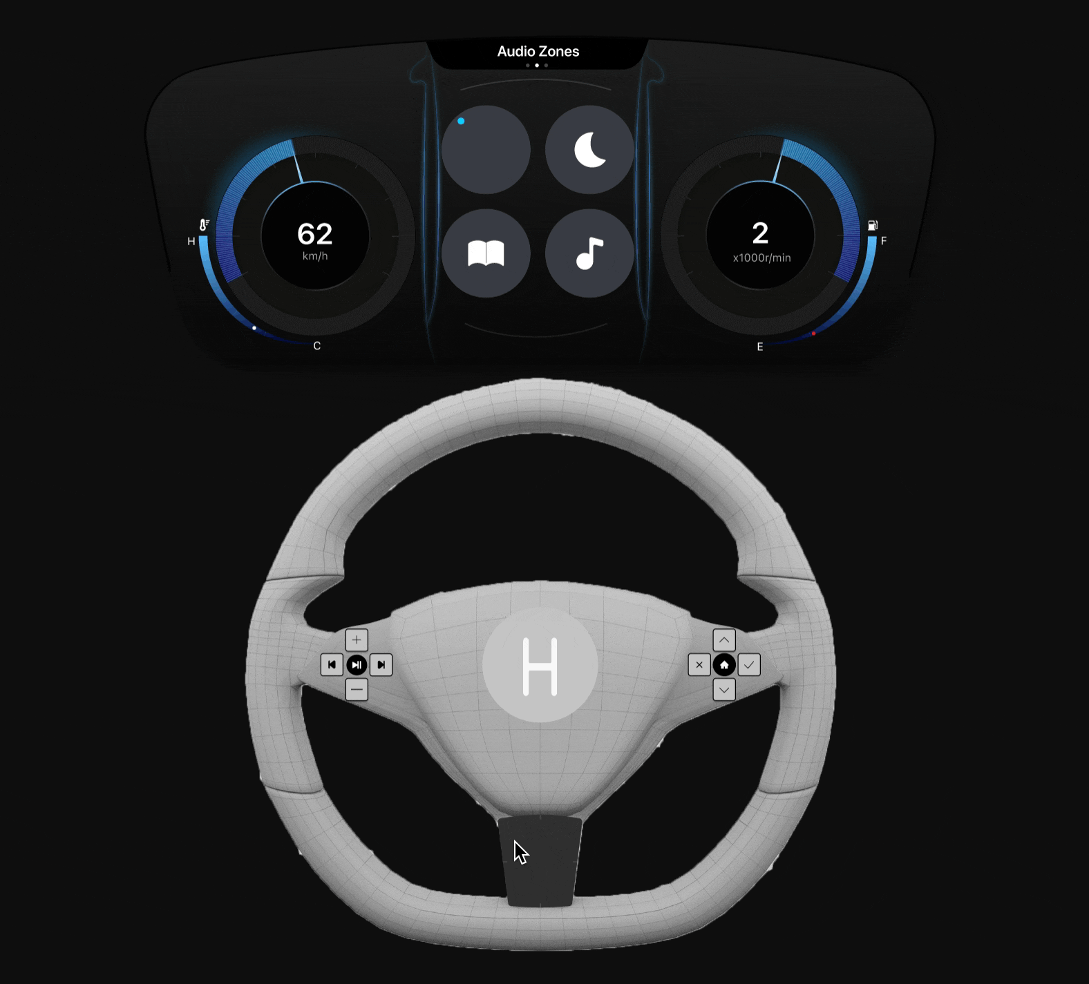
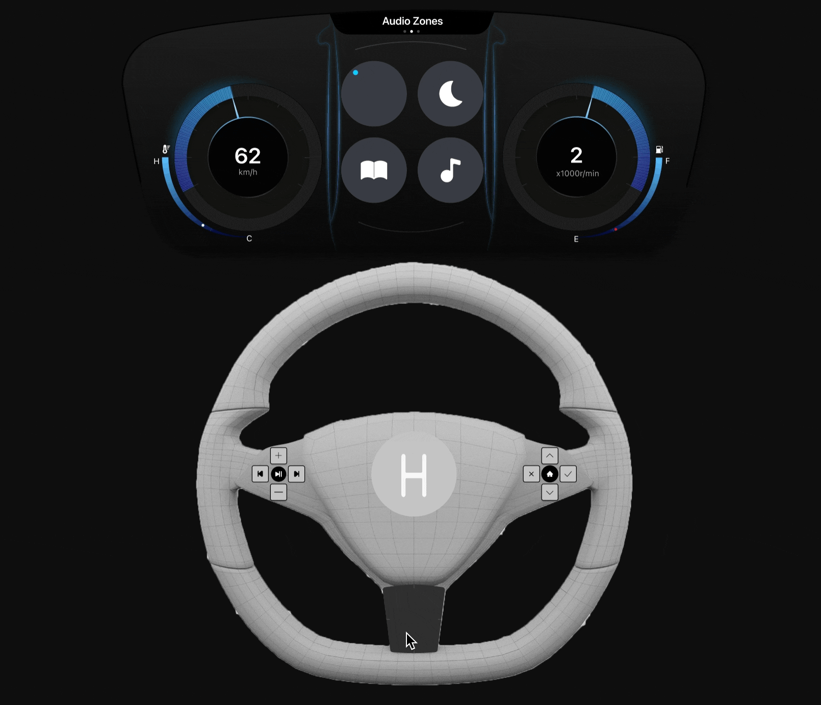
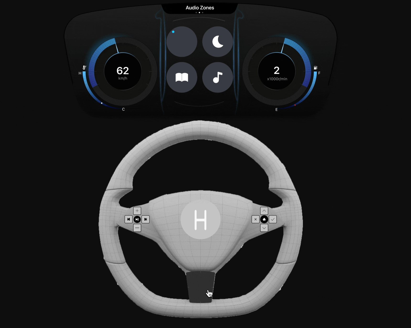
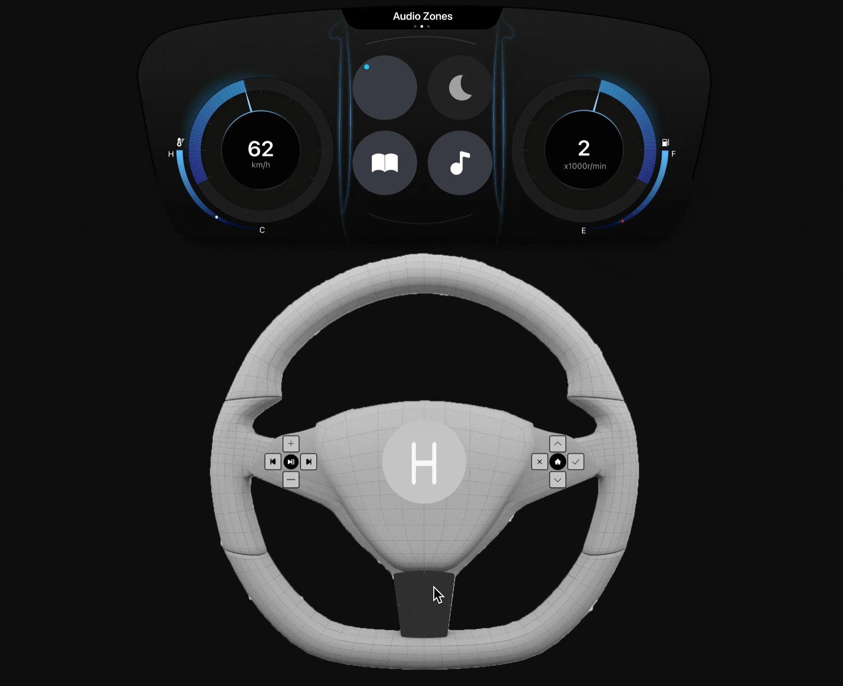
Control interface for driver
Steering wheel: Button clusters + a trackpad + Voice control button
Driver Dashboard
The system interface is displayed on the dashboard behind the wheel, it appears between the other dashboard information (e.g. speed, RPMs, fuel, temperature). The screen corresponds to any actions that the driver makes from the steering wheel controls.
An embedded car system that
facilitate family harmony &
respect autonomy
As user research revealed that disagreement arises as a result of the media environment, we implemented the personalized audio zone technology that allows isolating and sharing one’s media choice to eliminate the disagreement. We also acknowledge the importance of managing children’s media consumption and device usage brought up by our interviewees, we designed admin control to ensure some extent of parental control, such as audio monitoring, setting volume limit, disabling share-request feature of other zones, etc.
Audio monitoring
Driver/A co-admin can have access to monitor other passengers’ audio for 10 seconds.
Let me check what my kid is listening…
Share/request media
Users can request from or send an invitation to one or more passengers to share the media together in the car. Users are able to disconnect from all the shared audio zone with one click
Oh, I like the song, I want to listen to it with my kid together!
Admin control
The driver has the master admin control, they can also assign other passengers to be their co-admin to manage the audio zones so that the driver can stay focused on driving.
I want to focus on driving, can you take care of others for me?
Volume limit
The admin can set the maximum volume for other passengers to control the impact of sound penetration from different sound zones.
The volume is too loud for my kid, I need to protect their hearing
Do not disturb
Do not disturb mode prevents any connections from being made to the user who has it activated. The mode respects an individual’s personal space in the car.
I want to be alone for now.
Control interface for passenger
A touch screen on the armrest of the door
The passenger will have all basic features: share/request media, do not disturb; the passenger who has been assigned as a co-admin can manage other audio zones, such as monitoring 10s audio, setting the volume limit, enabling/disabling share-request function, connecting other people’s audio zones.
Evaluation
Validating 2 requirements:
Harmonious car environment
& Intuitiveness
Considering the timeframe of the project, we were able to make the evaluation plan for only two design requirements. Since Our technology addresses the conflicts raised by different media preferences, we want to test in-car harmony to better understand if our design achieves this goal and facilitates the users' needs. Also, Being that this technology would be a drastic change to the currently existing car audio systems, we want to test the learnability, efficiency, and accuracy of the system.
Participants:
Our ideal target users are Families (parents and children). Due to the requirement of this project, our participants were MS-HCI peers. We conducted the test with 4 users in total.
Conducting the user test
Method 1: Cognitive walkthrough
We chose to take a task-based approach to directly understand the ease and efficiency of how users would utilize the system to perform tasks. We identified 7 tasks for drivers and 6 tasks for passengers to complete. Each of the tasks was developed and guided by our user personas, key findings, and features.
Method 2: Usability Test
We chose to do a usability test to understand how intuitive our user interface is. We used the same 7 tasks for drivers and 6 tasks for passengers to complete. By having our users use the “think-aloud” process, we also gain insight into how users mentally process our system and how their mental model compares to our system’s design.
Results & Findings
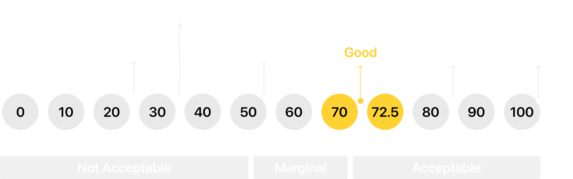
System usability score
Driver score: 72.5 | Passenger score: 70
SUS questionnaire helps us access intuitiveness. Our SUS data suggests that our system has above-average usability. However, it does not suggest that our system fully meets the design requirement of intuitiveness. It indicates that there are certain minor changes that need to be made to our system in order to achieve a high degree of usability.
Visibility issues
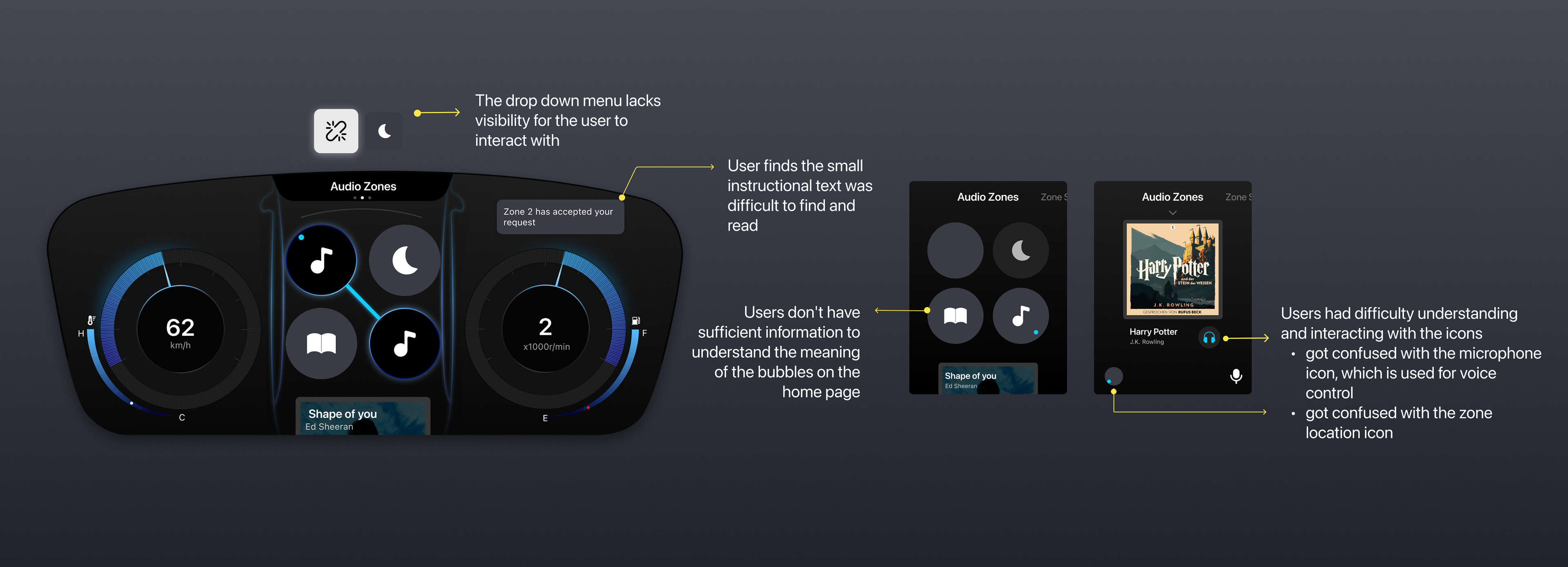
1. Users acknowledge the value of designed features, but the learning curve may affect the overall harmony at the beginning
see evidence below
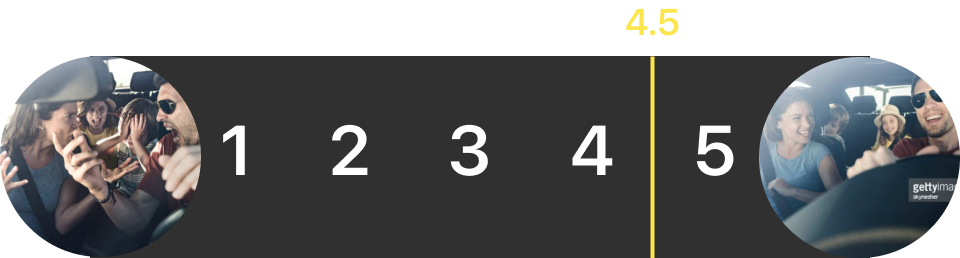
Likert question
Avg. rating of each task: above 4 | Total avg. : 4.5
After completing each task, we gave our users two pictures for them to rate (1=frustrated, 5=harmonious). The results indicate that our user believes that the system supports the objective of facilitating social harmony in the vehicle.
Open-ended question
Q1: How do you think this feature affects social harmony in the car?
Our evaluators also mentioned how features like share/request, disconnecting, and admin control would limit in-car interruptions, give users freedom and control, and provide them with privacy.
Q2: What are your feelings while you perform this task?
However, our evaluators' feelings while using these features contradict the fact. Specifically, they mentioned feeling confused, forgetful, and overwhelmed, which may potentially affect the social harmony between passengers. Further, features like audio monitoring and disabling the share-request function were considered as potential sources of annoyance.
2. Users want to have the ultimate control over the system, including invisible state and off-state (Driver only)
The user pointed out in the cognitive walkthrough that the audio UI is taking the place of other important information about the car, like field gauge, which is essential for drivers. He would want to hide the UI of the system when he is not using it.
For the open-ended question after the cognitive walkthrough, our user expressed that he would want to have a kill switch to turn off the system. In a severely unsafe scenario like a snowstorm, he’d like every passenger in the car to pay attention to the road condition and silence so that he could concentrate as a driver.
3. Users have concerns about privacy and people listening and monitoring their media
One user who participated in a driver user test expressed her concern about kids’ feelings when they see their parents are monitoring them. Another participant who did the passenger usability test also said he would be “annoyed” by being monitored. He would not monitor his kid’s media if he is the parent. This finding gives us insight into how privacy may affect the harmony of a family in the car together.
4. Interactions to share and request media did not match users mental model
For the task of sharing the media with a passenger, our participant rated ‘No’ to the question “Will users understand how to perform the action” in the cognitive walkthrough session because he said that the drug action requires learning. For the usability test (see below), our participants all failed on the same task and had the longest completion time compared to the other tasks.
5. Users want to request media from the media monitoring page and not have to go to the bubbles page to send requests
Based on the observation of actions that the user performed for the task of requesting media from other passengers, our user clicked into the media content page to initiate the request media function, which is not a correct action. This finding reveals that the design of this feature does not fit the user’s mental model and lacks intuitiveness.
Self-reflection
Design Iteration
Competitive analysis
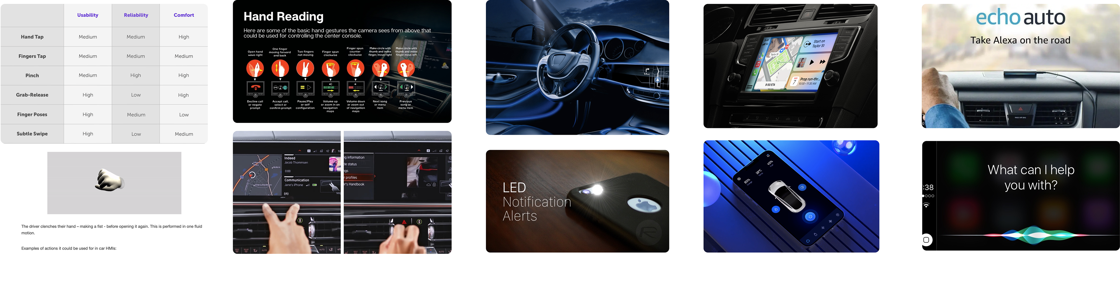
Card sorting
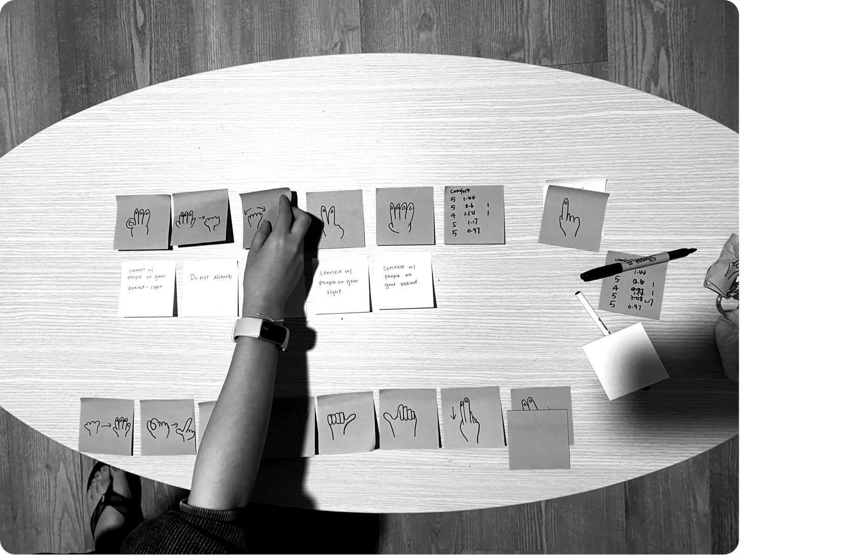
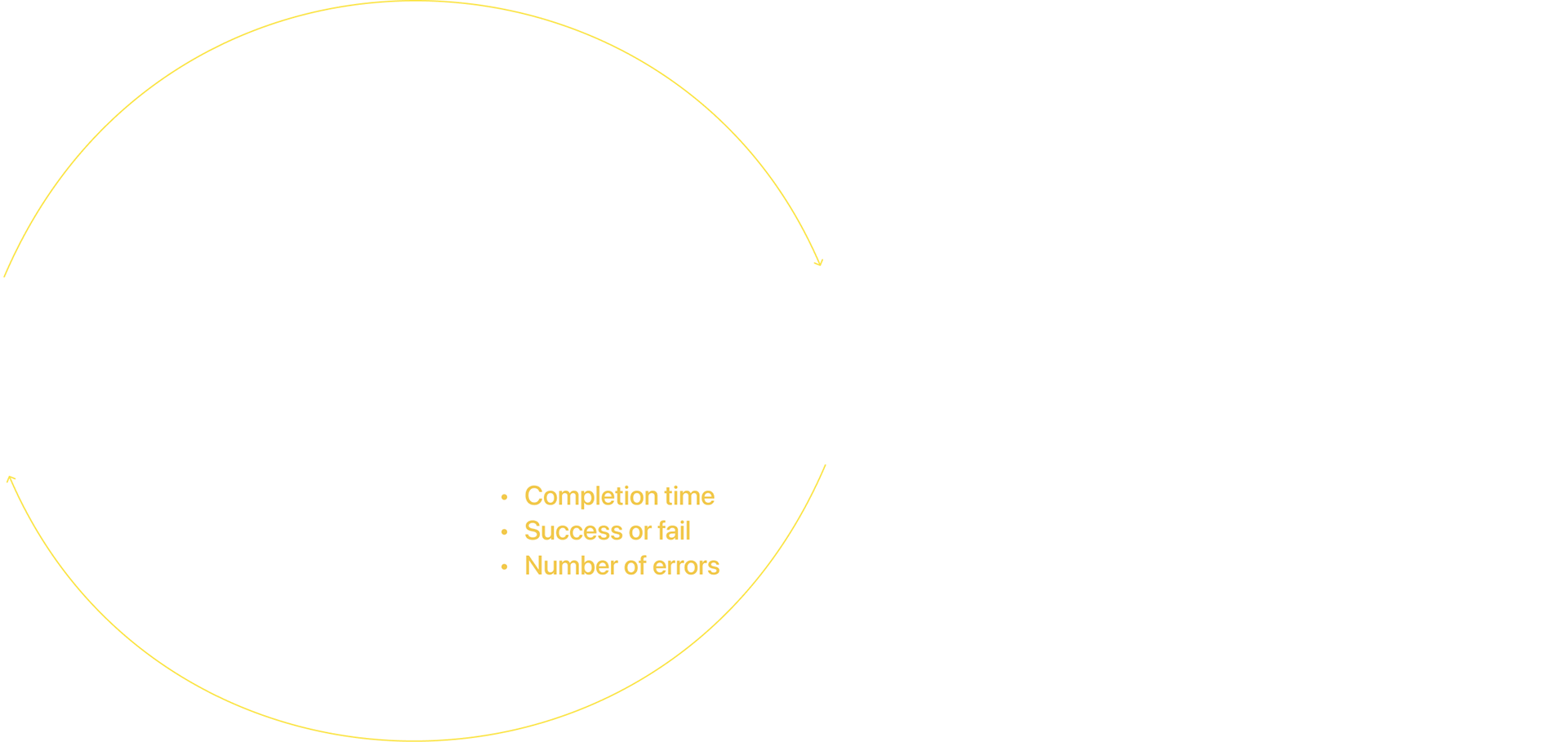
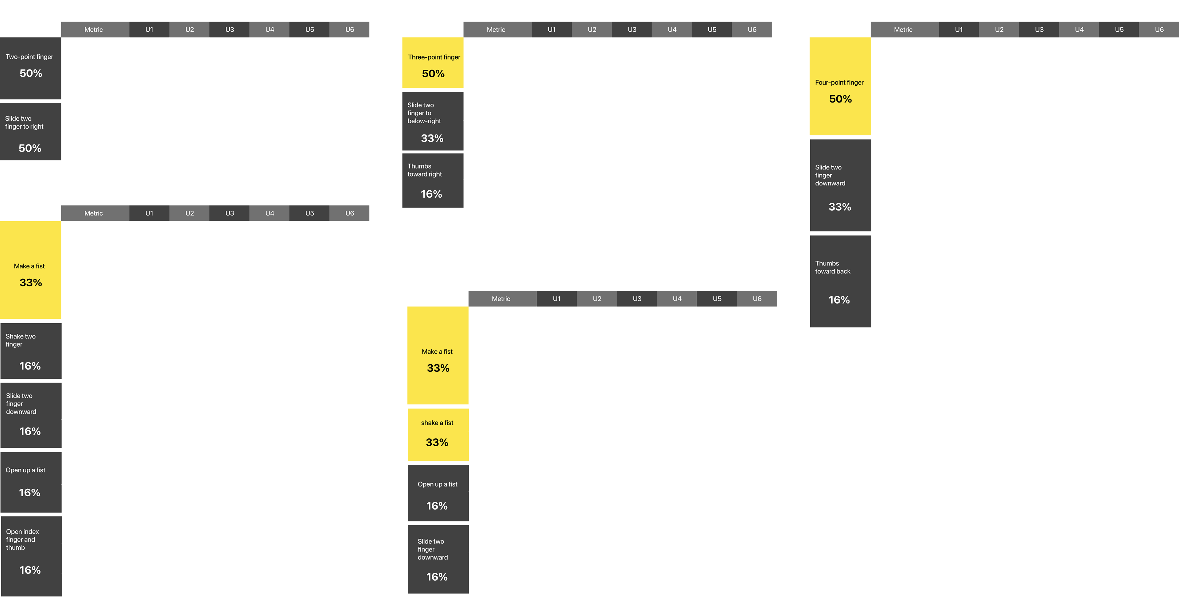
I conducted the session with a total of 6 people. I described five driver actions to the participants, and they would choose the gesture that best fits their behavior pattern among the provided gestures, and map them one by one to each action. Then I asked them to rate the comfort level of each gesture. After that, I randomly gave a command and participants would respond with the selected gesture. I recorded their reaction time and error rate to compare the usability of each gesture.
Quantitative Results
Gesture control guideline
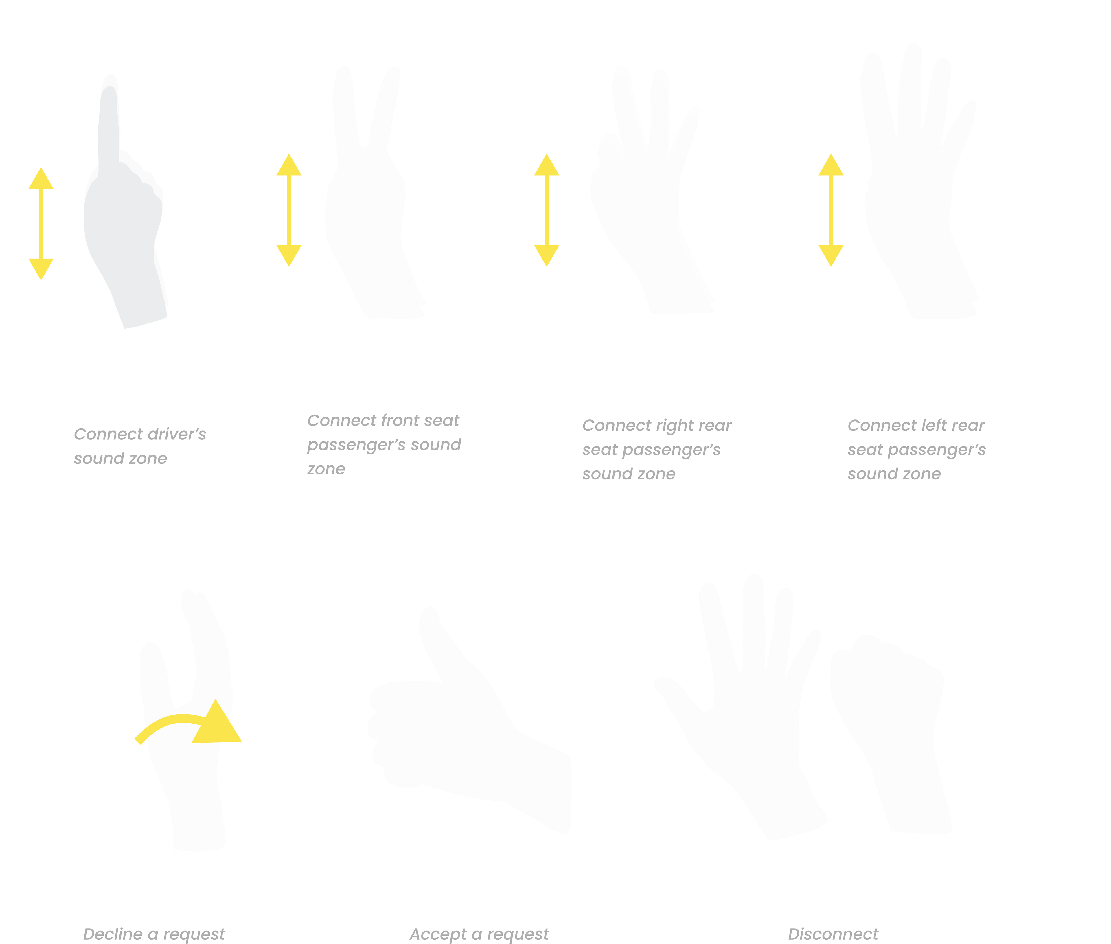
Driver Zone's User Flow
What I learned
Detachment from my own bias
Learning not to design for ourselves and focusing on designing for our users. Understanding how to do user research and analyze qualitative data can make the design logic more solid and user-centered. It informs me that design cannot depend on the designer's intuition, but needs evidence and rationale to support every decision I make.
Balance feasibility and novelty
Designers should not blindly pursue innovation and ignore the feasibility of the system. In the design process, I focus on whether the system conforms to the user's mental model, such as testing the learnability, visibility, accessibility of the system, and so on.
What we should do differently